Picture your best account. Health score’s been green for six months straight.
They log in every week. They’ve never once filed an angry ticket. Paid on time, every single invoice.
Then the cancellation email lands.
No warning. No red flag. The dashboard swore this one was fine.
That’s the account every CS lead has lost at least once, and it’s the reason nobody fully trusts the score anymore.
Why don’t customer health scores predict churn?
Health scores mostly track activity: logins, ticket counts, feature clicks, not intent. An account can hit every green threshold while quietly deciding to leave, because none of those signals capture whether the customer is actually getting what they came for. That gap is what CS teams have started calling green churn.
Here’s the part that stings. The reverse happens too.
An account files three angry tickets in a month, scores red, and renews anyway, because the champion who’s furious about a bug also happens to be the one fighting hardest to keep the tool. The score can’t see that either.
Green accounts leave. Red accounts stay.
If your health score is a coin flip dressed up as a dashboard, you’re not the only one who’s noticed.

Dashboard theater: why logins and tickets aren’t intent
Here’s the uncomfortable industry secret: this isn’t a you problem.
According to the ChurnZero 2025 CS Leadership Study, flagged in a breakdown by RevOps consultancy Inveo, most CS leaders say their current health score doesn’t reliably predict churn. And when researchers asked why, the answer wasn’t a bad tool or the wrong signals.
It was dirty data. Usage numbers that lag a month behind. Sentiment fields nobody fills in consistently. NPS scores averaged across an account instead of tracked per person.
A score built on stale, incomplete inputs isn’t wrong by accident. It’s wrong by design.
So teams keep watching the wrong thing closely. Logins measure whether someone opened the tab, not whether the work they came to do got done. Ticket volume measures whether someone complained, not whether they quietly stopped caring enough to complain at all.
That’s dashboard theater: a green light that makes the room feel calm while telling you almost nothing about who’s about to walk.
The scariest churn warning sign isn’t a spike in complaints. It’s a champion who used to reply in an hour now taking three days. Most dashboards never flag it.
2026’s new trap: an AI badge on the same broken score
Every customer success platform is racing to bolt “AI health scores” onto their product this year. New scoring types, sentiment layers, predictive churn agents, the works.
Here’s the catch nobody’s marketing slide mentions.
Adding AI on top of a score that already doesn’t work just makes the wrong answer arrive faster and look more confident. A model trained on the same stale logins and inconsistent CSM notes doesn’t get smarter. It gets a shinier interface.
That’s why the leadership study above lands as hard as it does. CS leaders aren’t short on scoring technology in 2026. They’re short on trust in the numbers underneath it, AI-labeled or not.
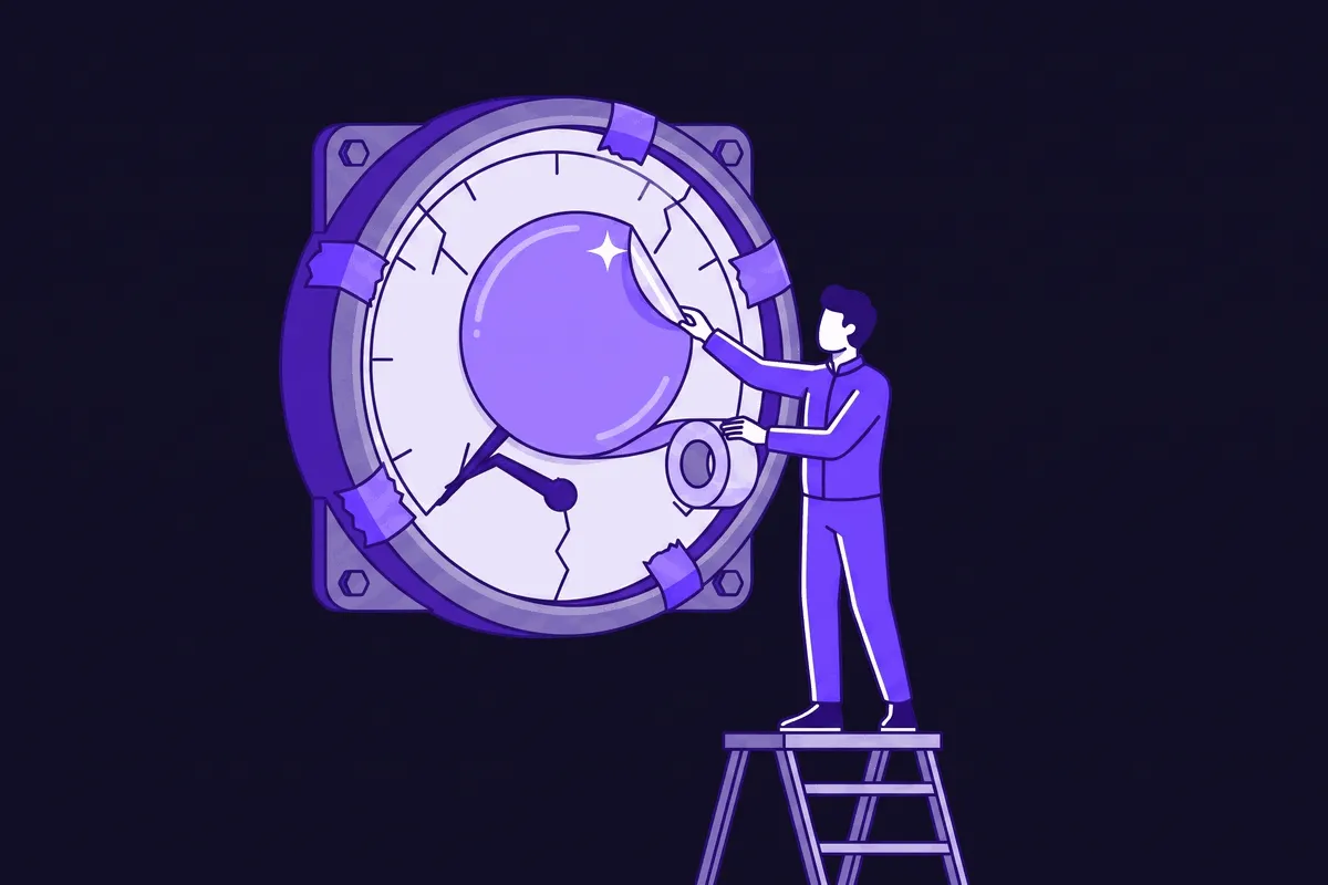
Before you trust an “AI-powered” health score, ask one question: is it scoring fresh, per-account data, or averaging the same stale usage and NPS numbers that already failed you? A smarter algorithm can’t fix a dirty input.
What actually predicts churn: score what customers say, not just what they click
So what do you watch instead?
Start with the signals CS leads already trust more than the dashboard, even when they can’t fully explain why.
Usage trends over weeks, not a single snapshot. Onboarding momentum, or the lack of it. A change in tone in a support thread. Replies that used to come back same-day, now taking a week. A recurring meeting that quietly stops getting booked.
None of that lives in a login count.
Qualitative input from the person who talks to the customer catches risk long before the metrics move. When a score drops, the useful question isn’t “how far did it drop.” It’s “why.”
Onboarding is where this shows up earliest and loudest. An account that never built real momentum in its first weeks is flashing a warning long before any usage graph turns red, which is exactly why it’s worth fixing the onboarding challenges that quietly stall new accounts before you ever get to a renewal conversation.
A decade-old but still widely-cited Wyzowl study found 86% of customers say they’d stay more loyal to a company that invested in onboarding them properly.
That number is old. The pattern behind it isn’t.
Momentum built early is momentum you can measure. Its absence is a churn signal your health score was never built to see.
A customer who used to log in daily and now logs in weekly is a louder signal than any green status colour. Track the direction, not the snapshot, and you’ll catch the fade weeks before the renewal date forces the conversation.
How to build a health score your team actually trusts
You don’t fix this by adding more signals. You fix it by trusting fewer, cleaner ones, checking your work, and closing the loop once you find something worth acting on, the same loop that runs through the rest of a solid retention playbook.
- Cut the score down to two or three signals you can keep clean, not fifteen you can’t. A simple score on fresh data beats a sophisticated one built on stale inputs, every time.
- Validate it against what actually happened. Pull your last ten to twenty cancellations and check: did the score flag them before they left, or only after? If you can’t answer that, you can’t improve the model.
- Give qualitative signal a real seat at the table. A CSM’s read on a cooling relationship isn’t a soft input to average away. It’s often the earliest data point you have.
- Treat the conversation as the audit, not the afterthought. The real reason customers churn rarely matches the box they tick on the way out, and the accounts you can still save need that same honesty applied while they’re still yours to keep.
Retention isn’t a scoring exercise. It’s a listening one, and most teams have the ratio backwards: heavy on the dashboard, light on the conversation.
It’s worth getting right. A long-cited Harvard Business Review analysis (2014) found winning a new customer costs 5 to 25 times more than keeping one you already have. Every green churn you catch late is a customer you’re about to pay full price to replace.
There’s just one problem: having a real conversation with every account on a book of two hundred, every month, is a full-time job you don’t have.
That’s the gap hollie, holito’s AI agent, closes. She has an actual conversation with each customer, on their own channel, and brings back what changed in their own words, not a number that averaged it away. See how holito does it.
Frequently asked questions
What is “green churn” in customer success?
Green churn is when an account cancels despite a healthy score: strong logins, few tickets, on-time payments. It happens because health scores mostly measure activity, not whether the customer is getting real value, so a disengaged-but-quiet account can look fine right up until it isn’t a customer anymore.
Why is my customer health score always wrong?
Most broken health scores trace back to data quality, not the wrong signals. Usage data that updates monthly instead of weekly, CSM sentiment fields nobody fills in, and account-level NPS averages all quietly poison the model long before anyone questions the weighting.
Should CS teams trust AI-powered health scores in 2026?
Only as far as the data feeding them. An AI layer on top of stale, inconsistent inputs produces a confident-looking wrong answer faster than a manual one did. Ask what data the model actually uses before you trust the score it spits out.
What predicts churn better than a health score?
Trends over time and qualitative signal: a usage line moving down over weeks, onboarding momentum in the first month, a shift in tone or response time from your champion. These surface risk earlier than any single-point score, because they capture change, not a snapshot.
The score told you nothing. The conversation would have.
Green doesn’t mean safe. Red doesn’t mean gone. The number was never the whole story.
Watch the trend. Listen to the tone. Ask “why,” not just “how low.”
The Bottom Line
A health score built on logins and ticket counts measures activity, not intent, which is exactly why green accounts churn silently and red ones renew anyway. Trust fewer, cleaner signals, validate the score against real cancellations, and give qualitative input from the people talking to customers real weight.
hollie can have that conversation for you, on every account, and bring back what actually changed in the customer’s own words.